COLOR + SPACE
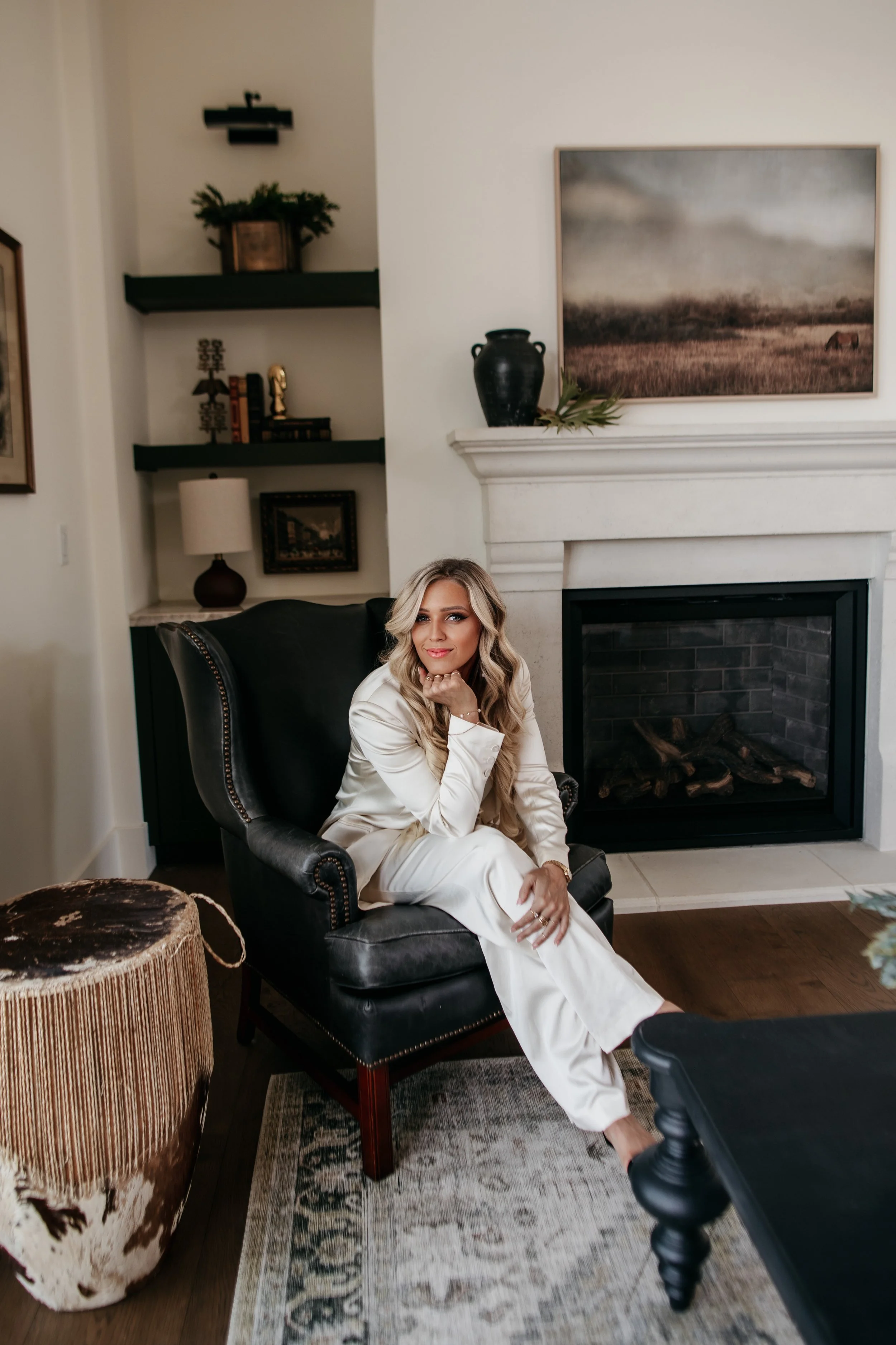
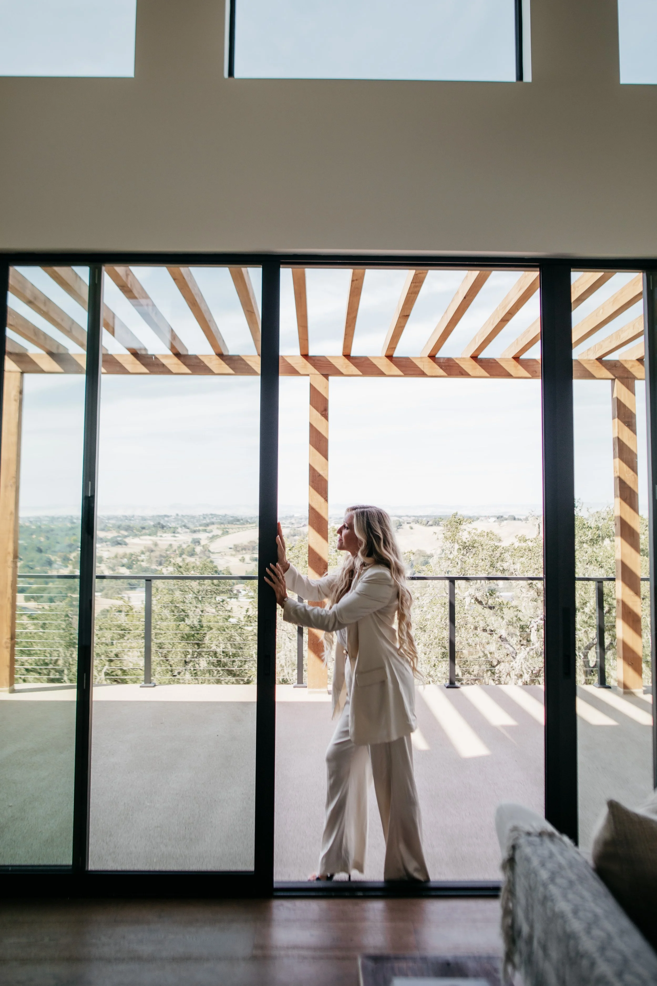
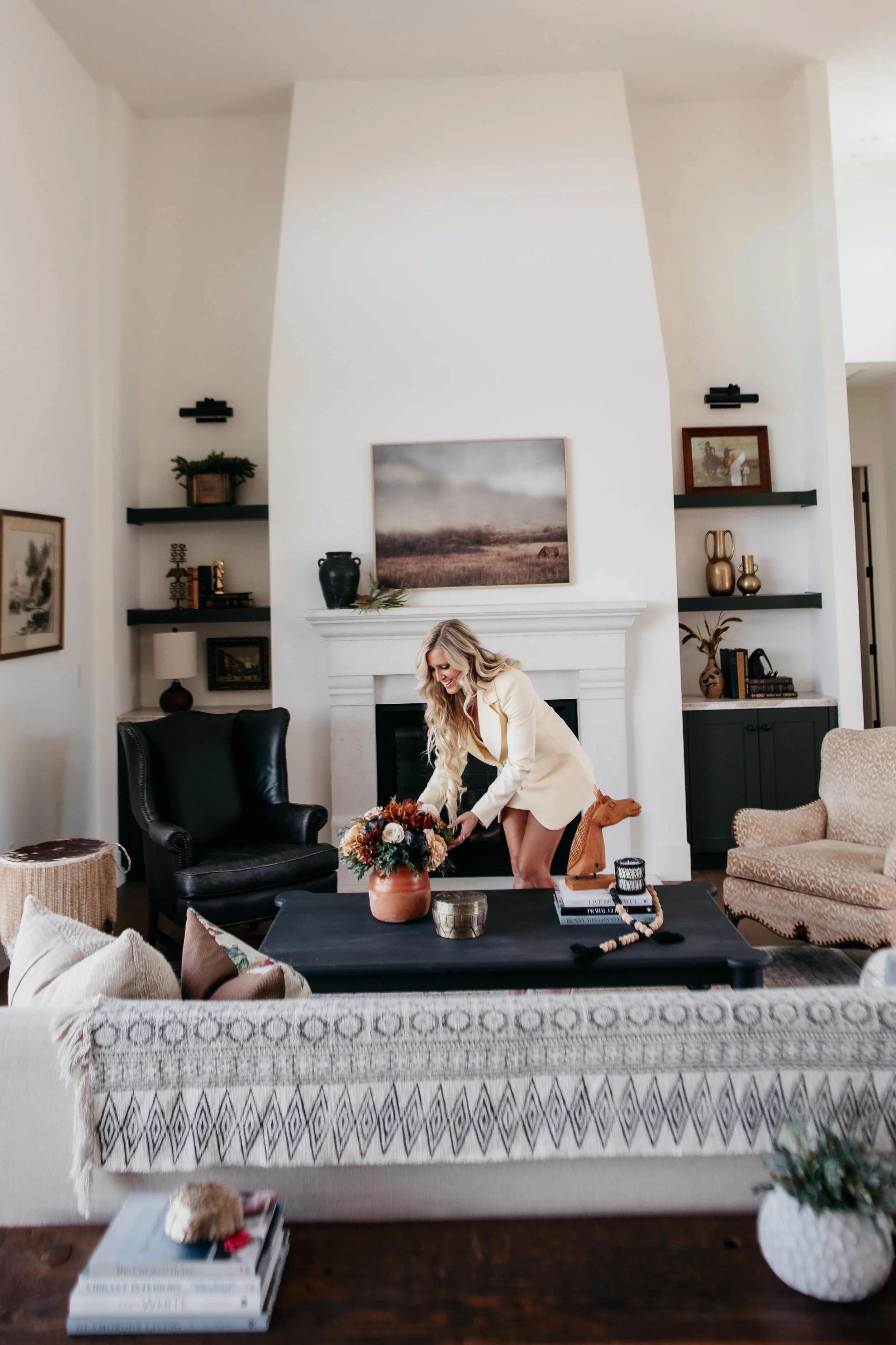
It’s amazing how color influences us. Color has the power to literally transform a space and influence out emotions. It can create joy, passion, sadness, peace, excitement. White walls, white bed spreads, white towels can influence the amount a house can sell for through staging. The color creates a presence of clean, large, open, bright and sets a tone much like a blank canvas so a buyer can visualize how they’d fill a space.
Studied have shown that often marketing companies will utilize the power of color. Here are some examples I found when thinking about how color influences design.
Common emotional associations:
• Red — urgency, excitement, appetite. Used for clearance sales, fast food.
• Blue — trust, calm, stability. Common in banks, tech, healthcare.
• Yellow — optimism, attention-grabbing. Good for warnings and impulse buys.
• Green — growth, health, wealth. Used for eco-friendly and financial brands.
• Black — luxury, sophistication. High-end fashion and tech.
• Orange — friendly, energetic, affordable. Often used for CTAs (calls-to-action).
• Purple — creativity, luxury, spirituality. Beauty and premium brands.
How companies use it strategically:
• McDonald’s / Coca-Cola — red + yellow combo stimulates appetite and grabs attention fast.
• Facebook / Chase / Paypal — blue signals trust, especially for anything handling money or data.
• Whole Foods / Starbucks — green ties to natural, healthy, sustainable positioning.
• Tiffany & Co. — trademarked a specific blue so strongly it’s now inseparable from luxury/gift-giving emotion.
• Amazon’s “Buy Now” buttons, Home Depot — orange for urgency without red’s aggression; it converts well as a CTA color.
• Target — bold red as a memorability/energy anchor even outside sales contexts.
Knowing this opens a world of possibilities! Even further reason to explore how color can create joy.